PROJECT DESCRIPTION:
Redesign Open Air Flowers' Website and Branding to reflect a more modern and tasteful look aligning with the new owners' vision.
COLLABORATORS:
Lexi Valverde, Joan Yun, Vanessa Belk, Jaden Bhang.
ROLE:
Branding Design, Checkout Pages.
TOOLS USED:
Figma, Adobe Indesign.
DESIGN PROCESS
Introduction
The design project for our group (named Blume Design) involved rebranding and redesigning Open Air Flowers' website a floral company that has been a part of the central coast for over 30 years. We aimed to create an intuitive, modern, and user-friendly online platform that aligns with the shop’s values and history. This process focused on updating their brand guidelines and the layout/functionality of the website.
Client Needs
Open Air Flowers is a well-established local flower shop in San Luis Obispo, known for its unique and beautiful bouquets. The clients wanted a platform that would effectively showcase their floral arrangements and simplify the shopping experience for customers as these needs were not met with the old website they had.
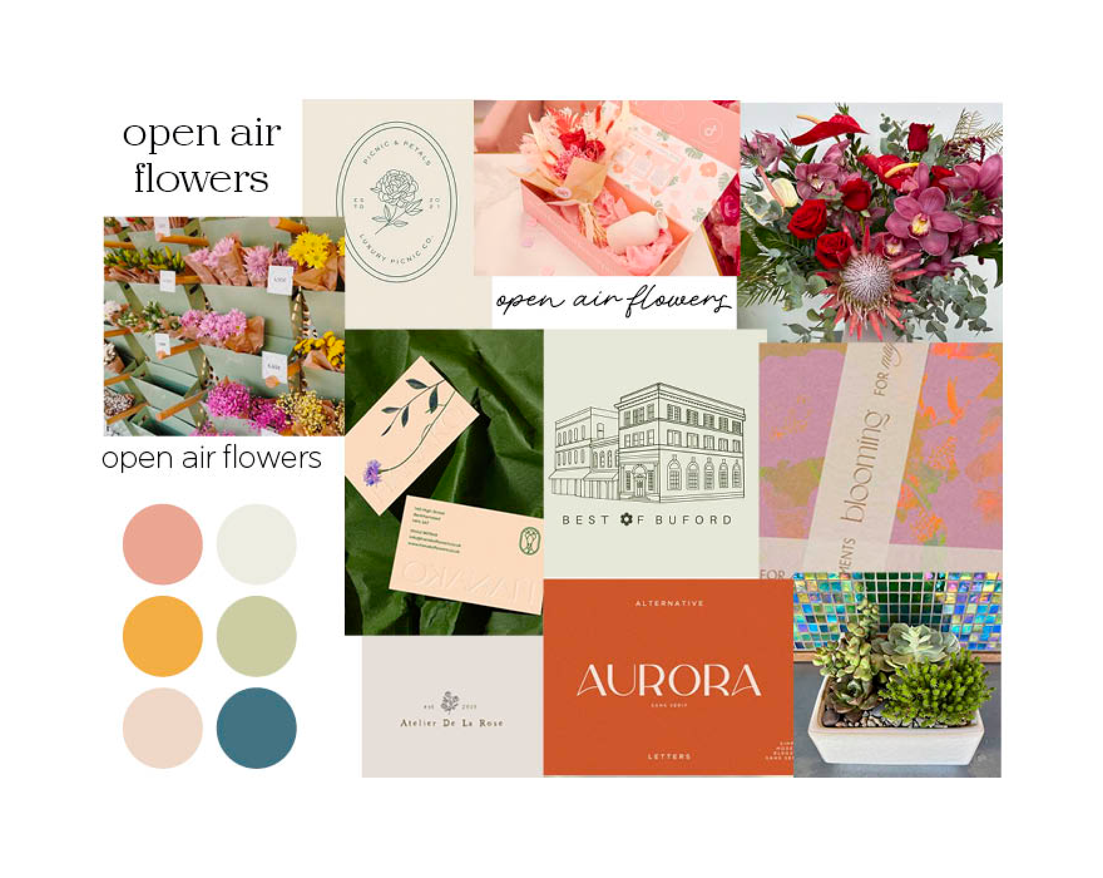

BRAND GUIDELINES
The clients, Gamal and Lisa, requested a modern website that honors the shop's history while incorporating a more modern style. My group and I all created moodboards and then merged our ideas together to create a more cohesive look.
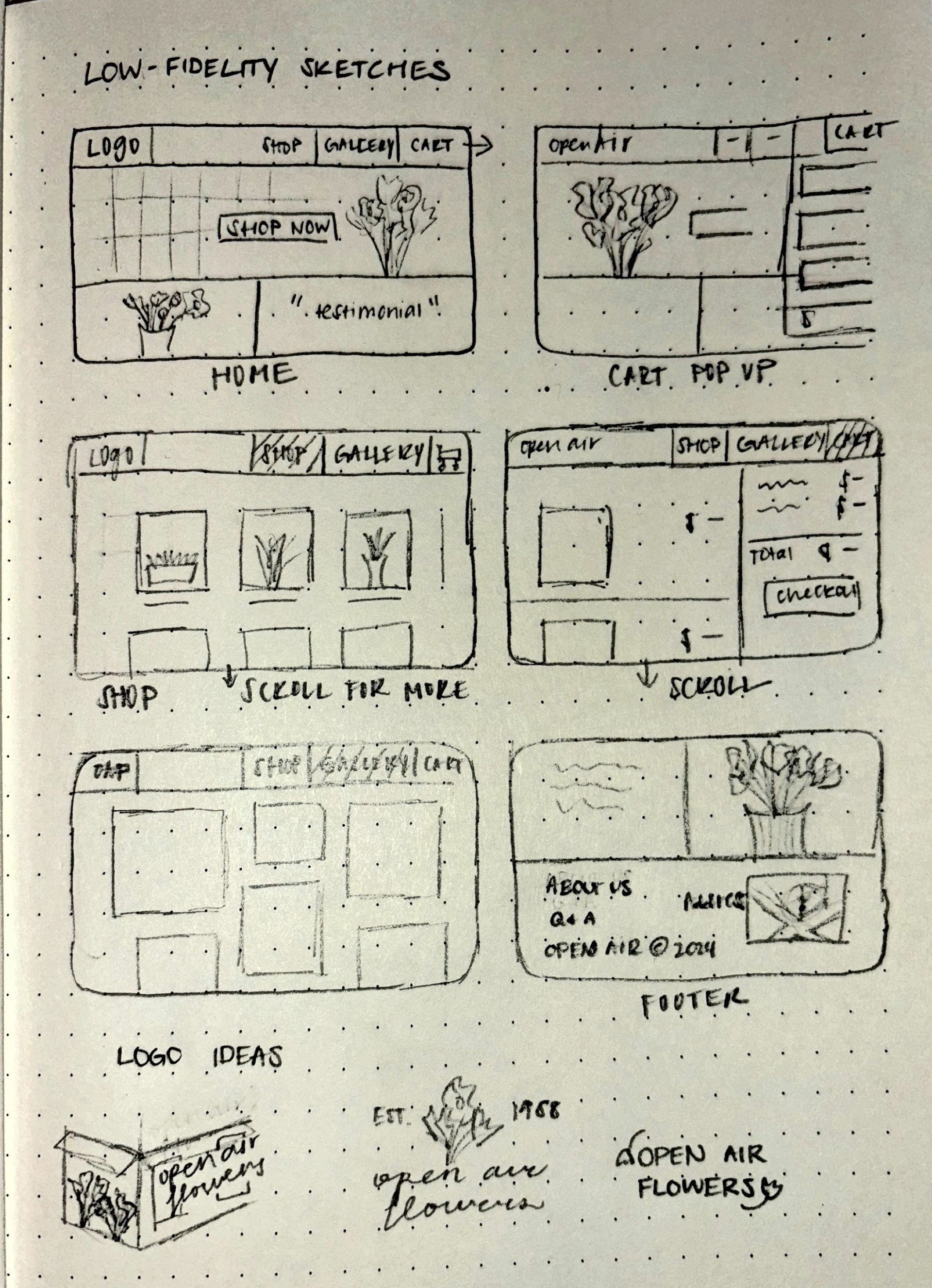
LOW AND MID-FIDELITY PROTOTYPES
Lo-fi prototypes were simple sketches or wireframes that outlined the website's structure and layout. This stage focused on planning the page arrangements and navigation paths, helping the team visualize the overall design. Once the basic structure was established, mid-fi prototypes added more detail with placeholder images, text, and initial color schemes. These prototypes provided a clearer sense of the final design, allowing for adjustments and feedback before moving to higher-fidelity designs.
HCI AND UI CONSIDERATIONS
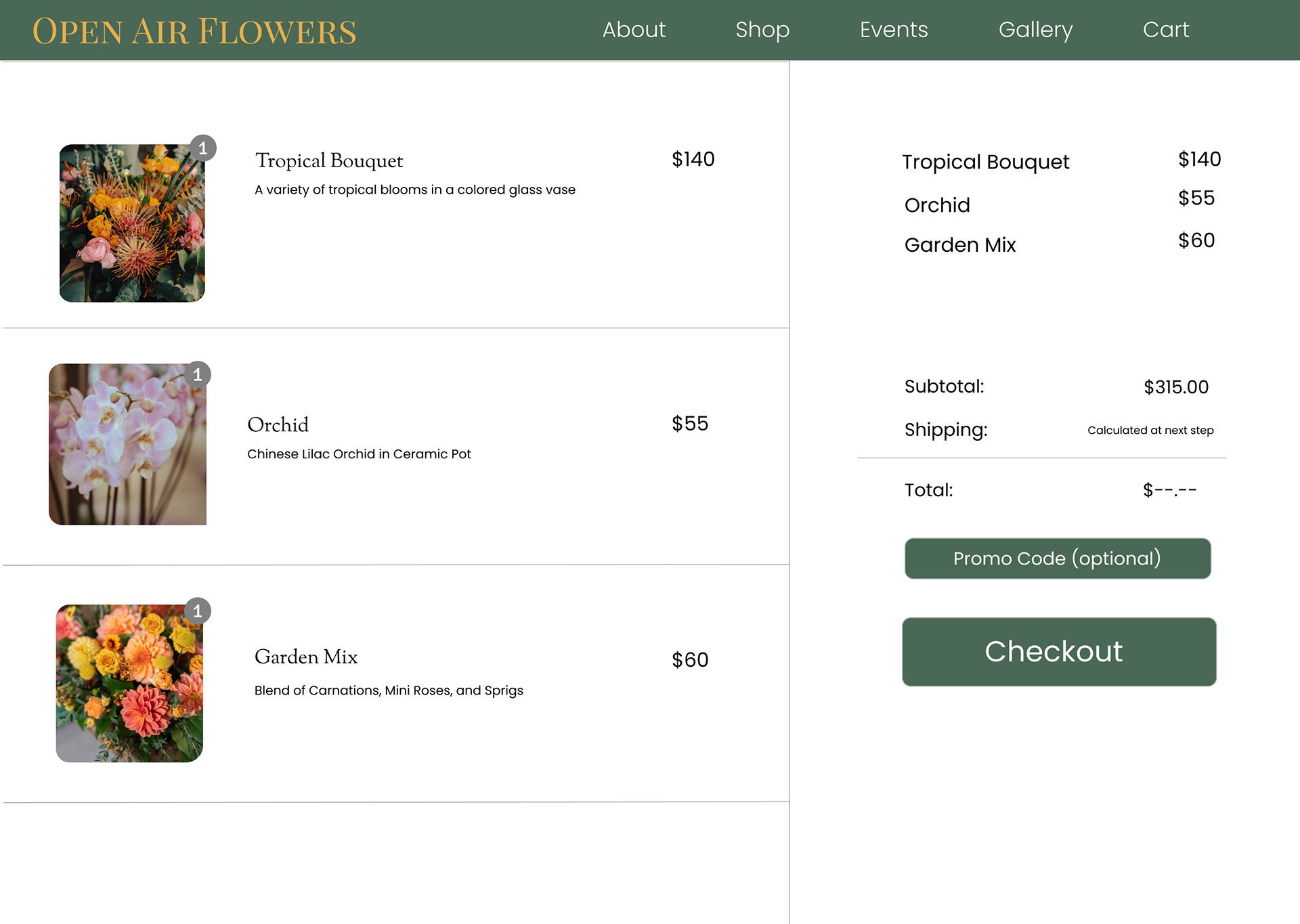
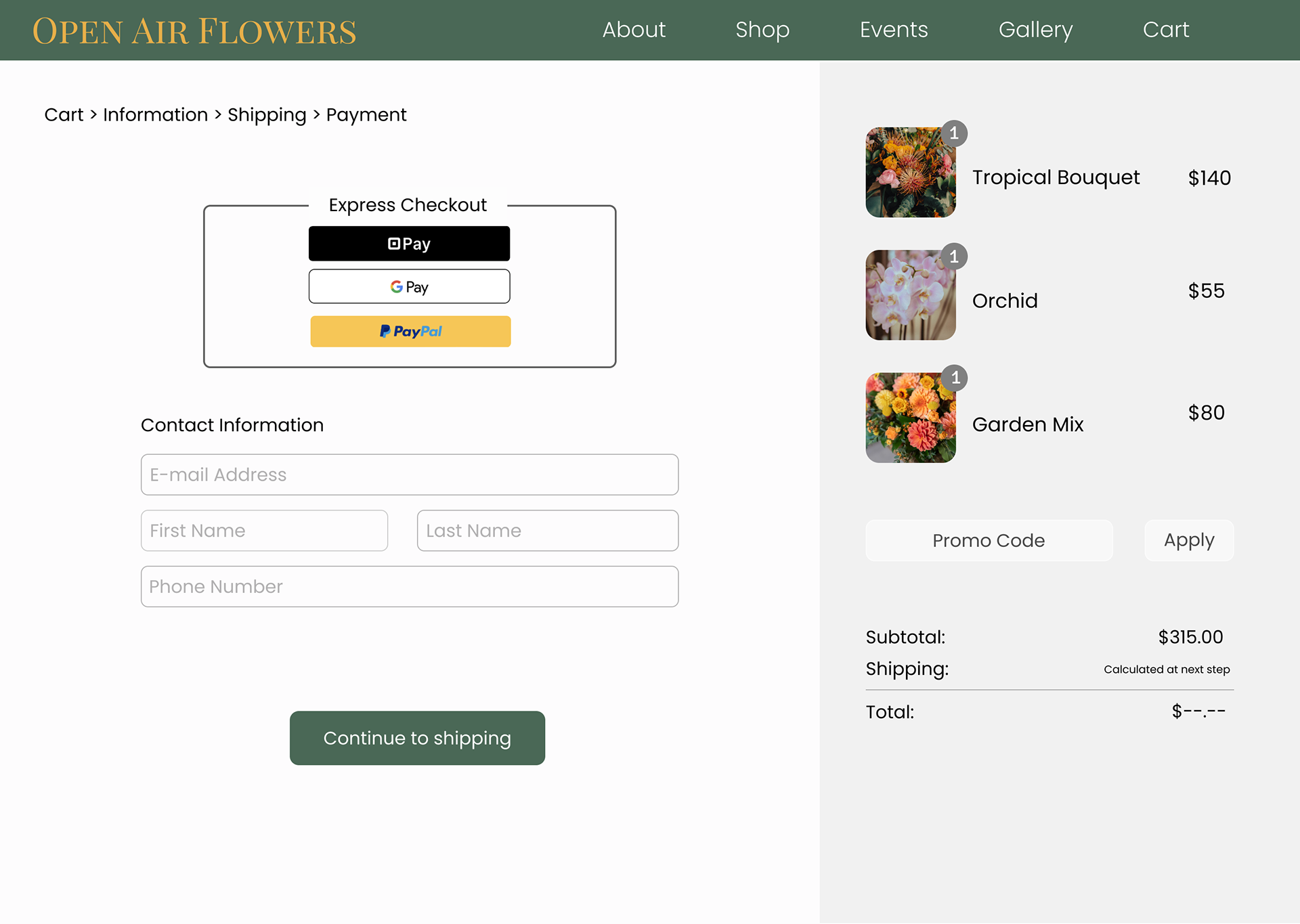
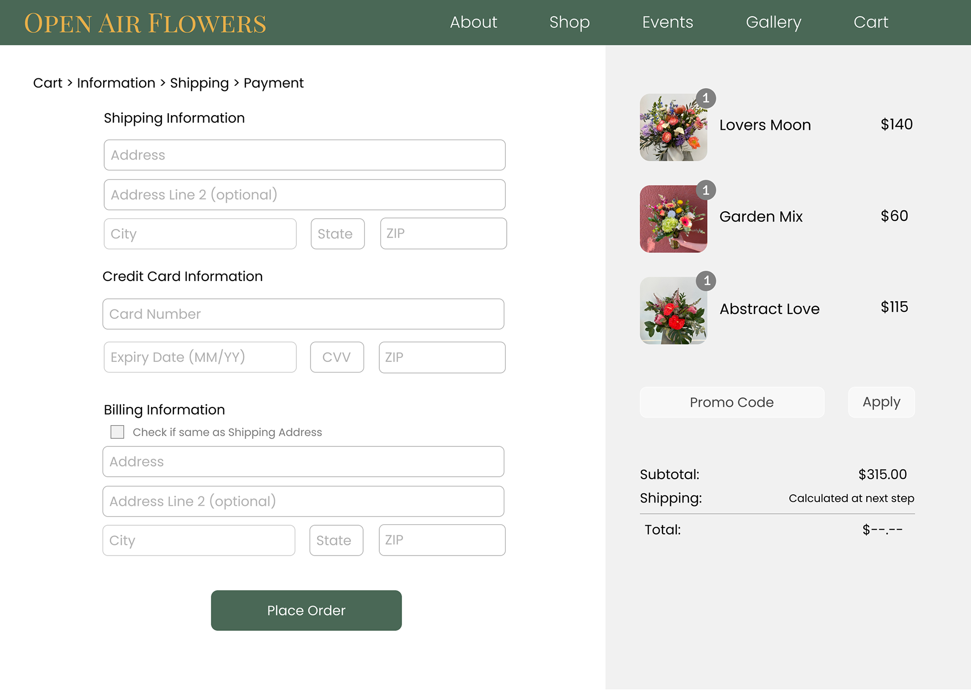
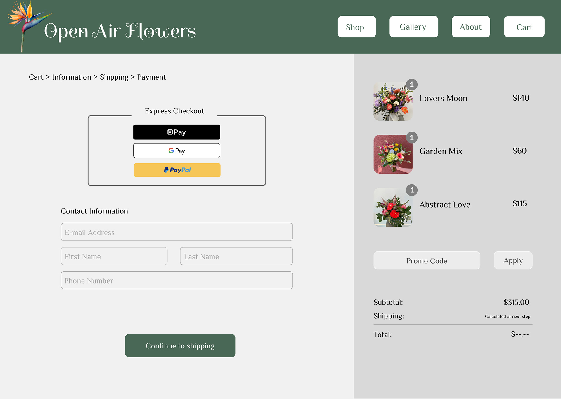
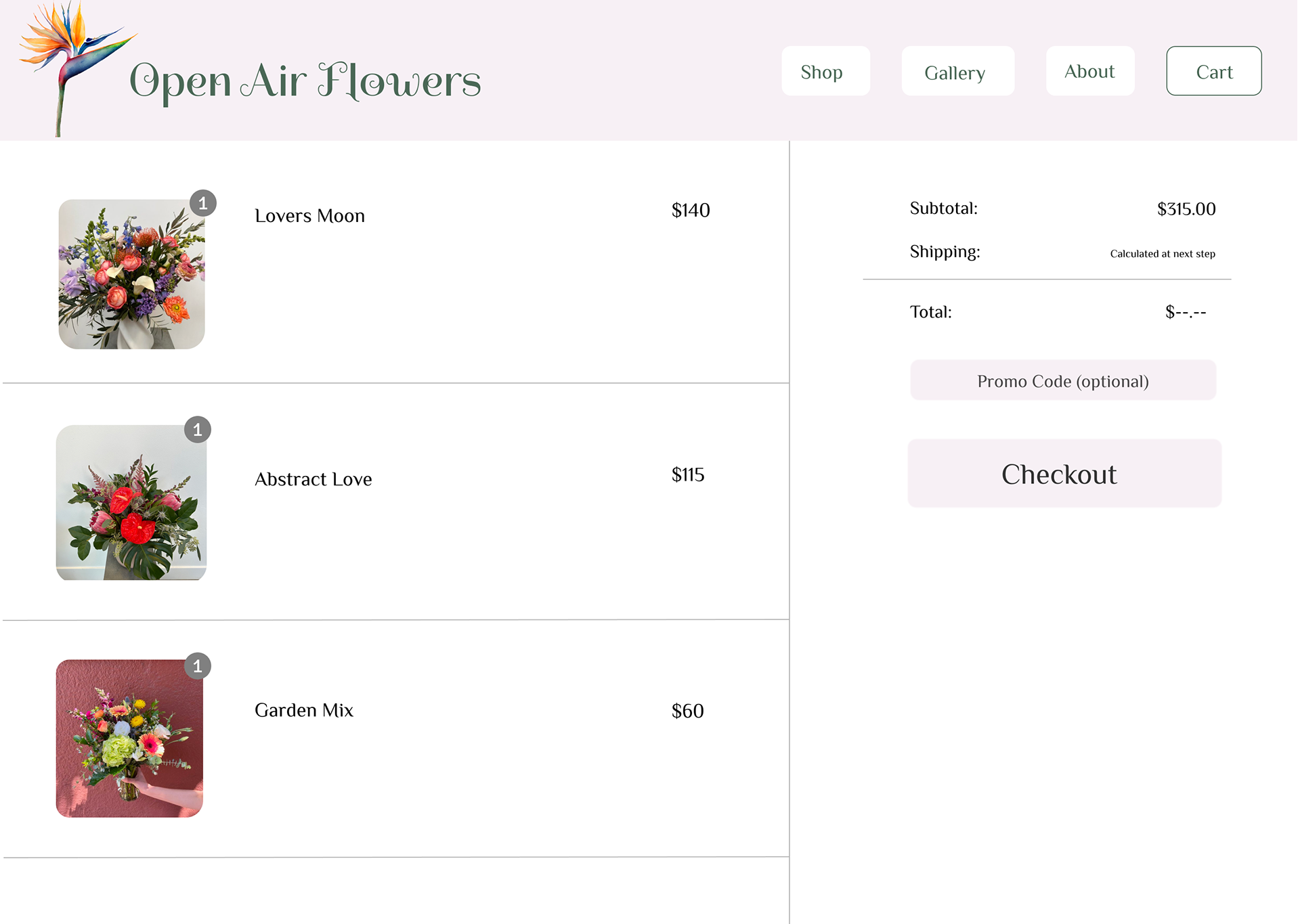
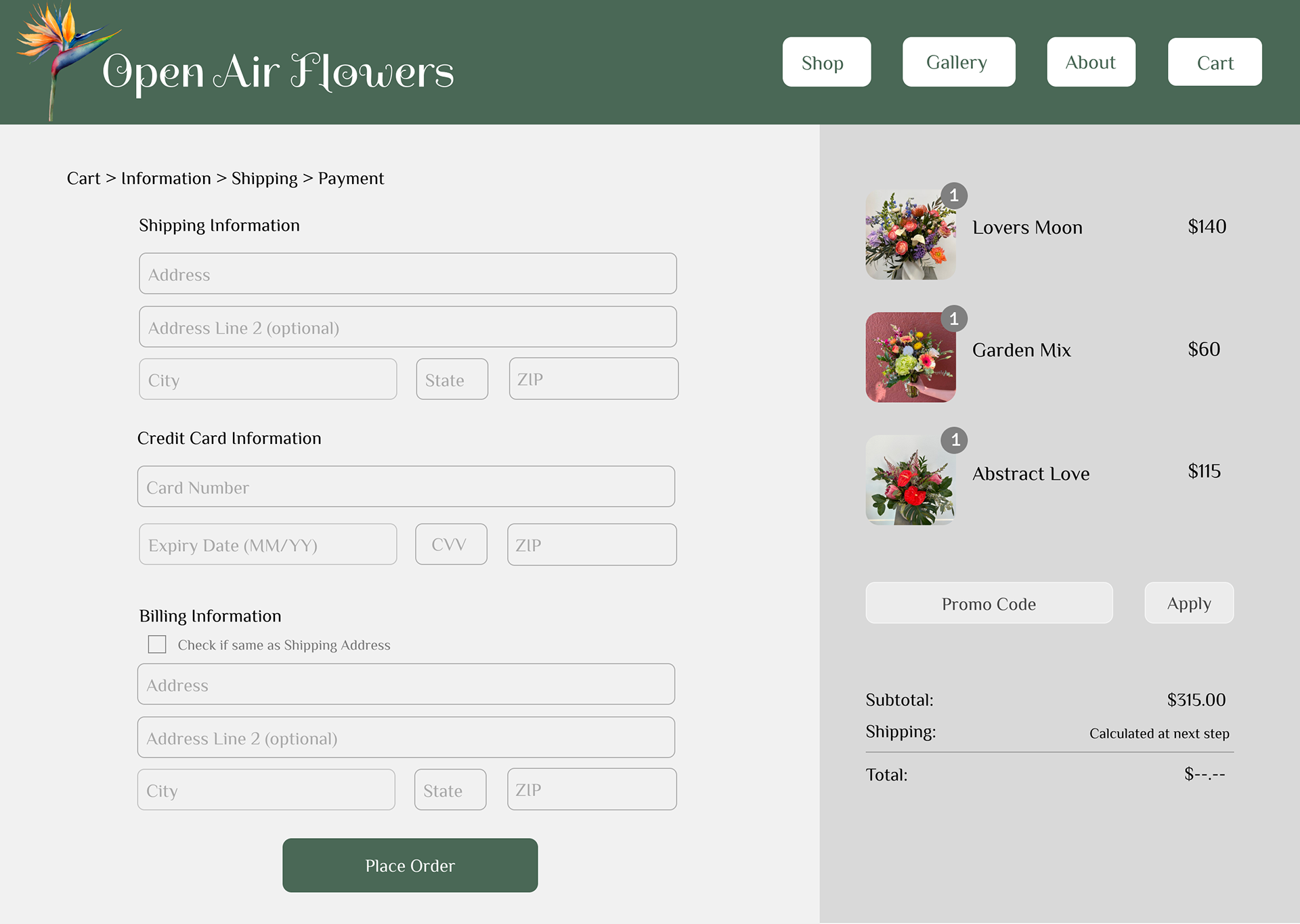
The checkout page is a critical component of the user journey, requiring a seamless and efficient design. I prioritized the following considerations for the checkout page:
Simplicity and Clarity
The page was designed with a minimalist approach, featuring a clear layout and intuitive navigation for ease of use. Users can easily review their cart items and proceed to checkout.
Accessibility
For ease of use, the design used strong color contrast, larger font sizes and clear button labels.
Brand Consistency
Forest green was chosen as the primary color to align with the client’s preferences and maintain brand continuity throughout the website. A consistent color palette and typography were used to reinforce the brand identity.
User Experience
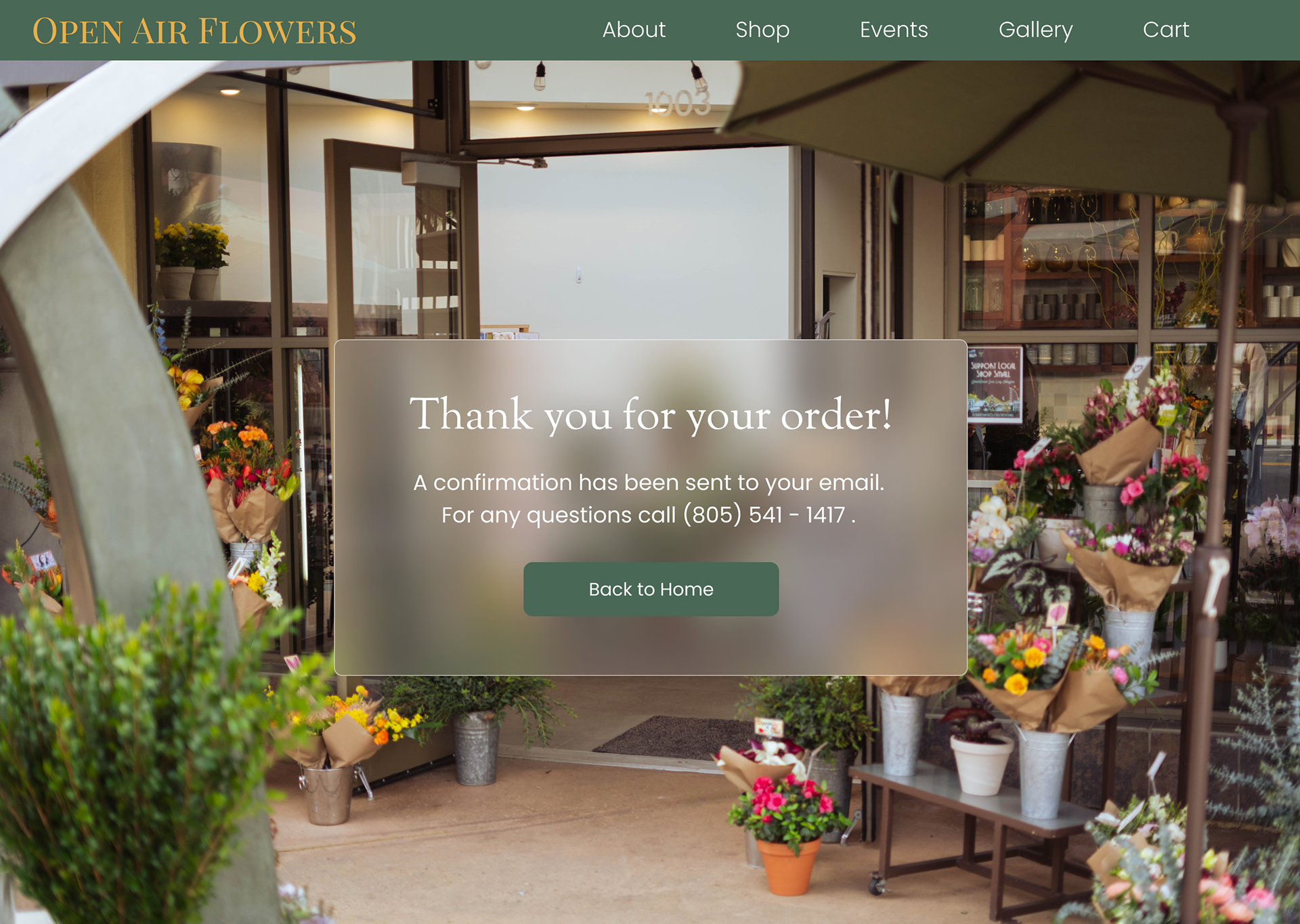
The checkout process had simple and clear form fields for user information and payment details. Clear confirmation messages and options to continue shopping were provided to users at the end of their purchase.
FINAL CHECKOUT PAGES
