PROJECT DESCRIPTION:
Design a technical paper to showcase understanding of Adobe InDesign, typography, and page layout.
ROLE:
Page Layout, Cover Art
TOOLS USED:
Adobe InDesign
PERSONAL GOALS
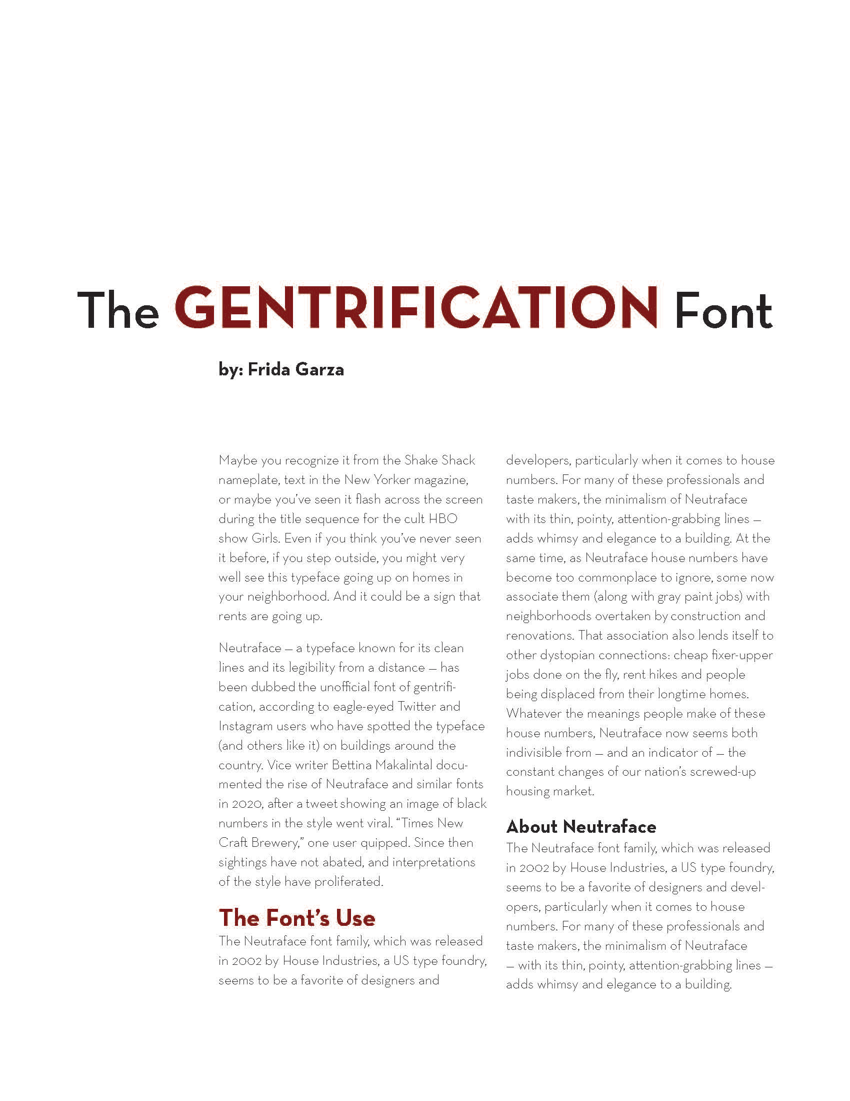
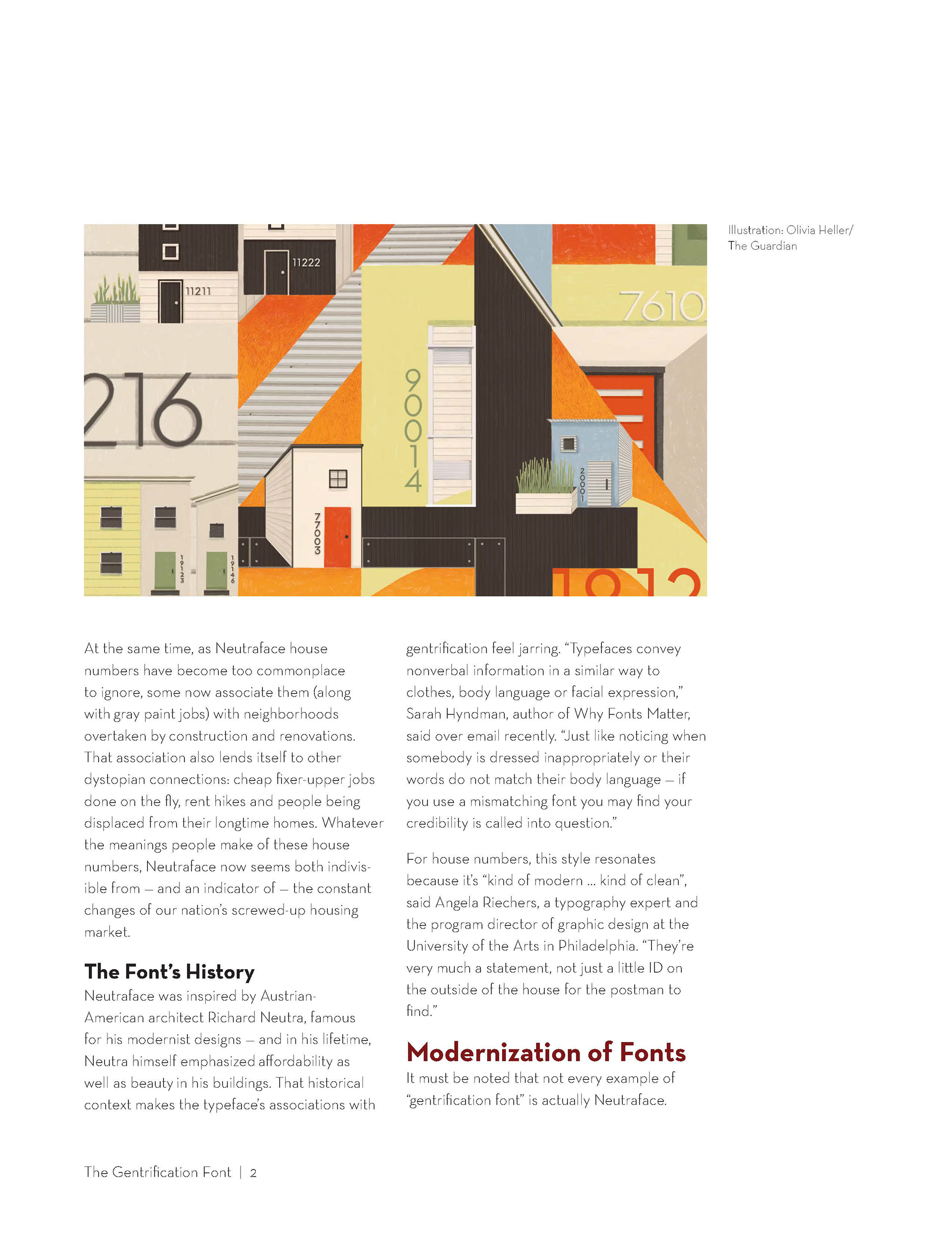
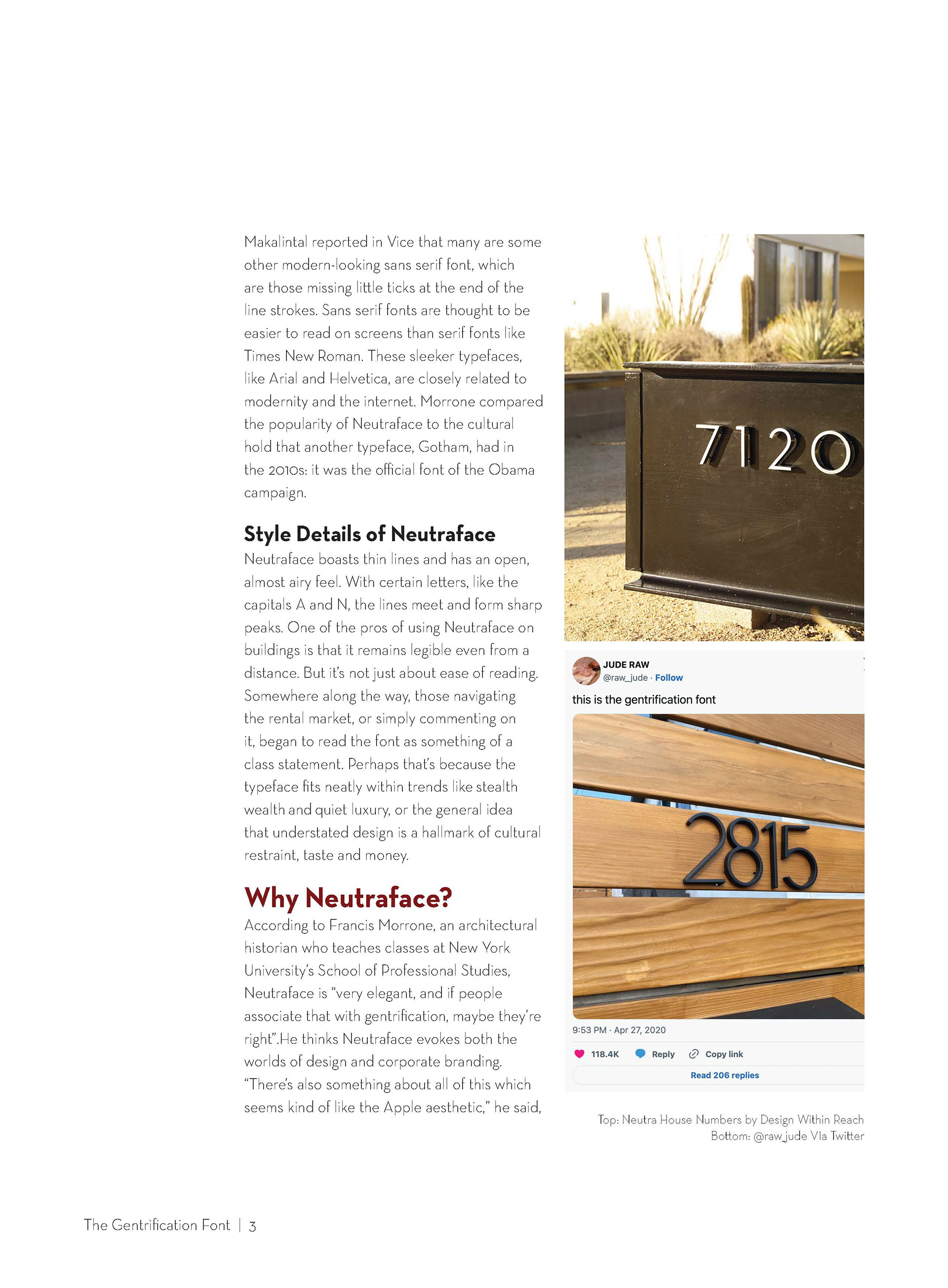
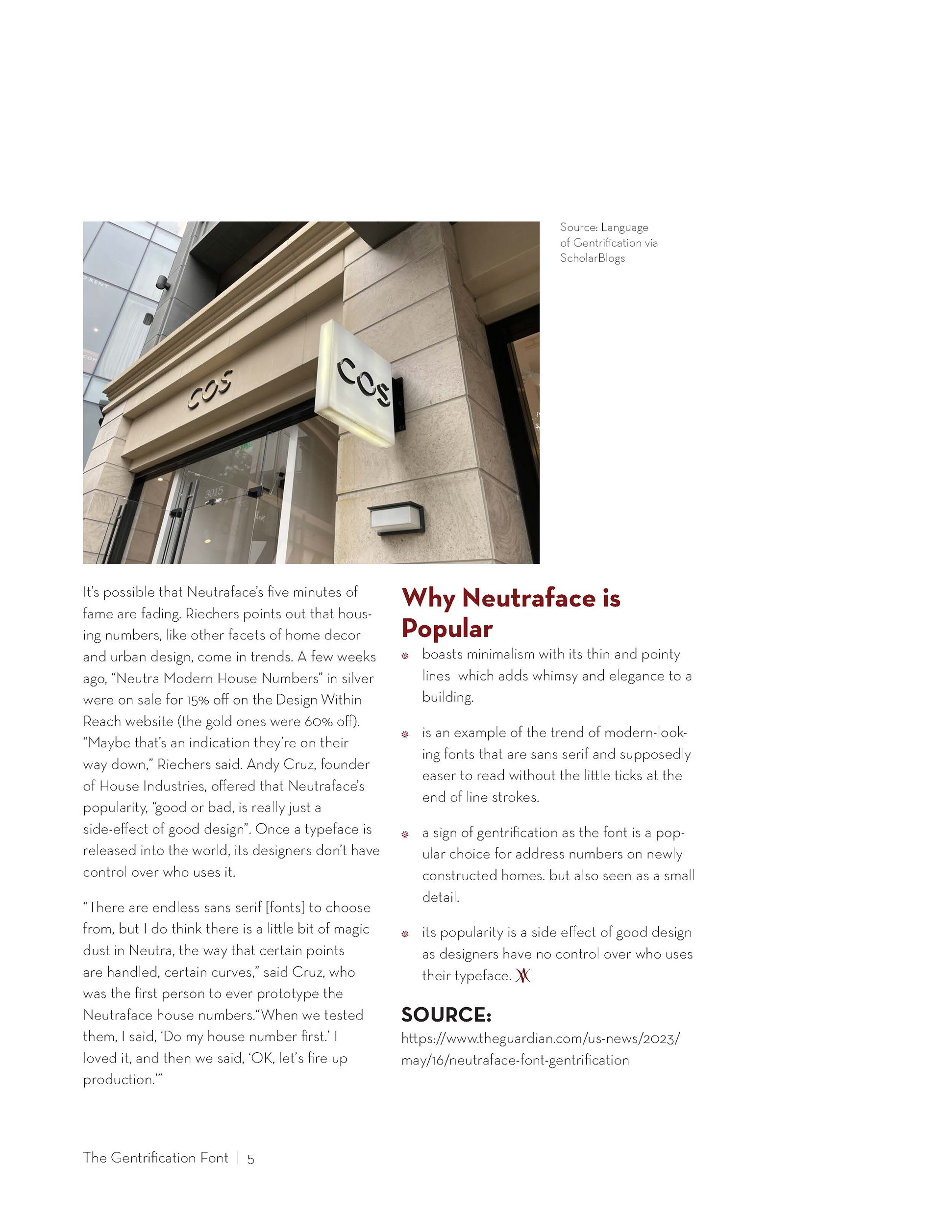
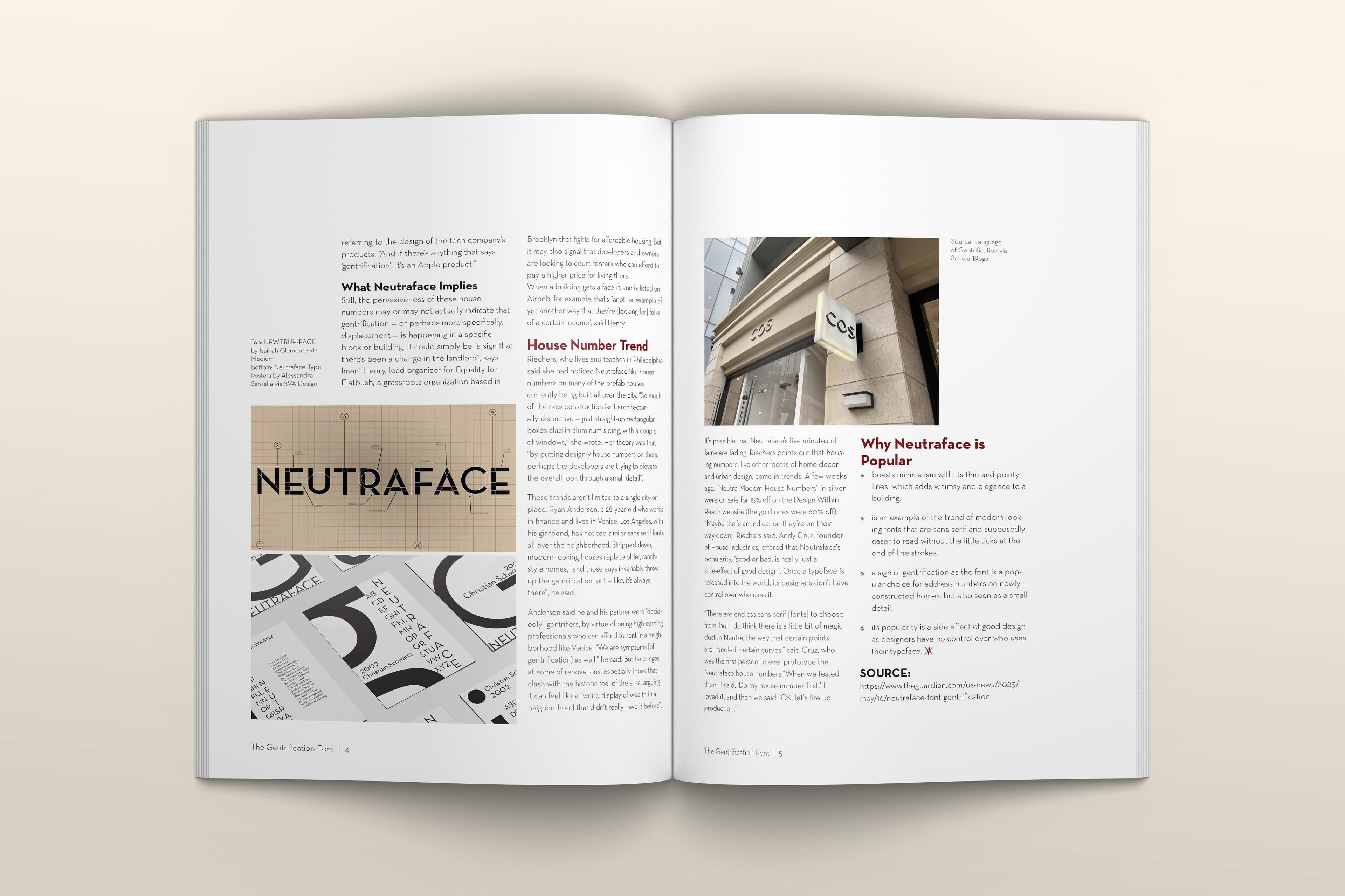
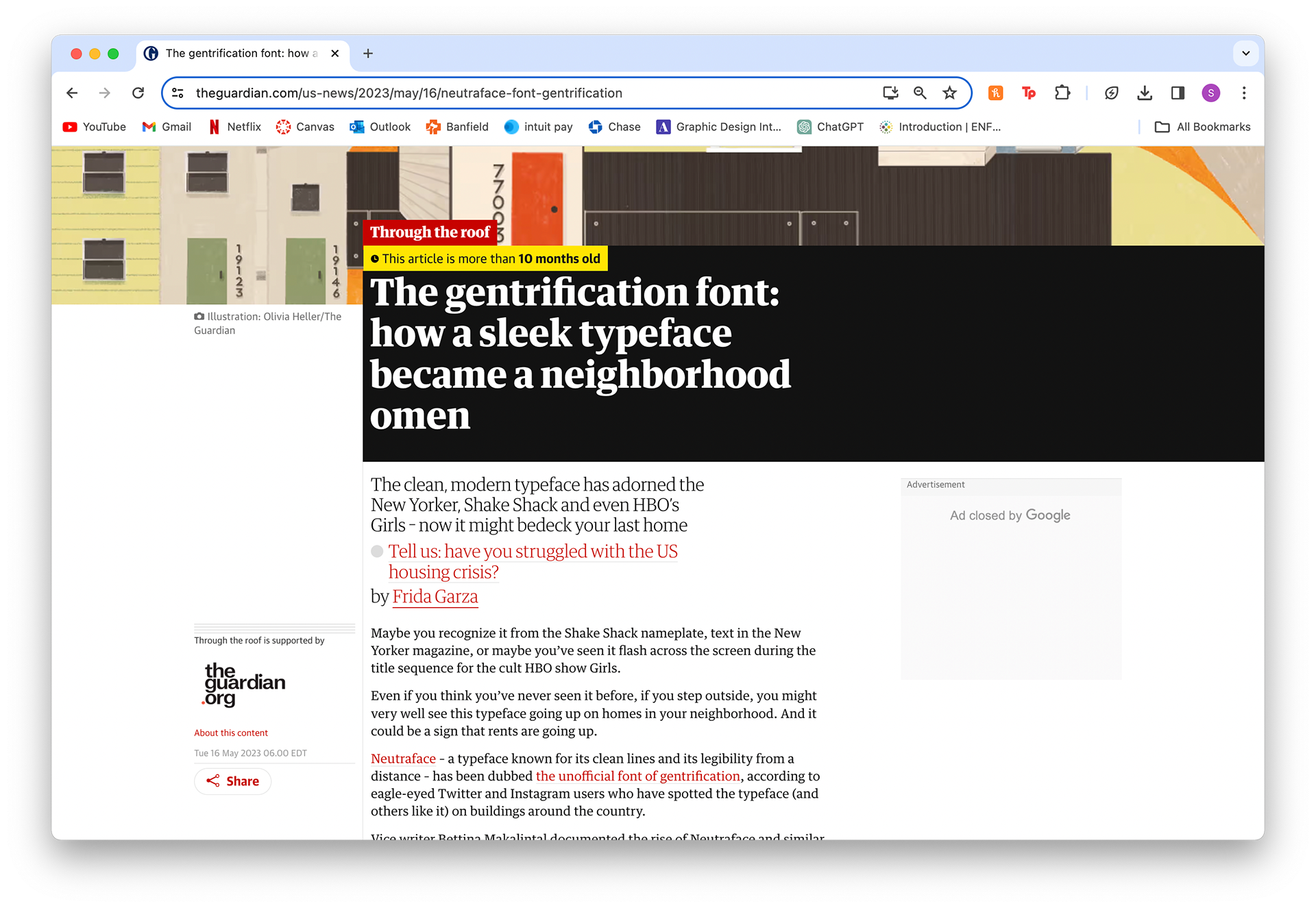
I chose an article to re-format on InDesign with a compelling topic related to typography. I picked one related to a typeface that is now commonly associated with the gentrification of neighborhoods. I wanted this article to translate well in print by adding more images and gaining experience with using various tools on InDesign.
DESIGN PROCESS
Introduction
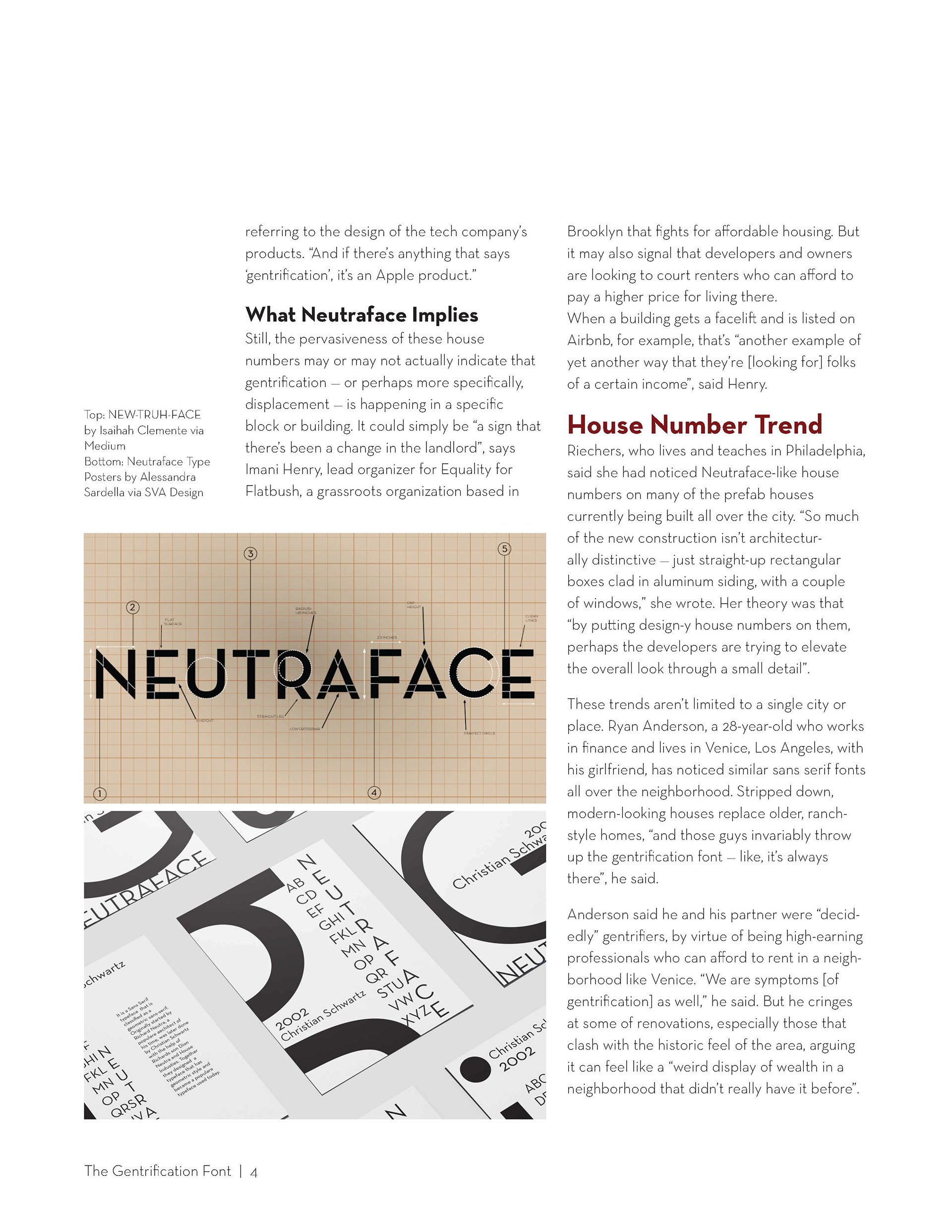
In creating a printed article from the original material, I aimed to enhance the reader's experience by incorporating more images and carefully structuring the layout.
Layout and White Space
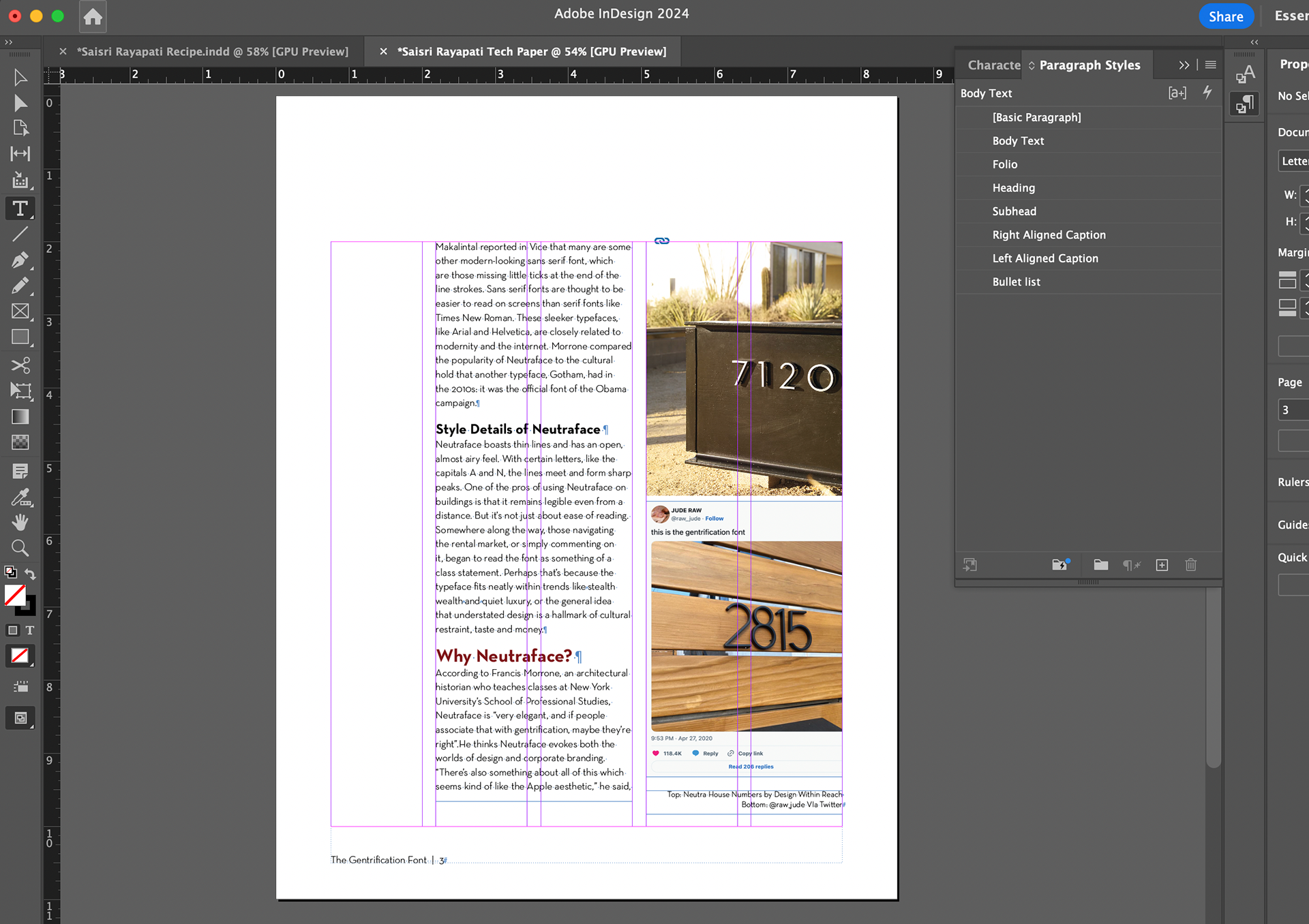
I utilized a 5-column grid across the pages for a balanced presentation of content. This helped with creating plenty of white space around the text and images, reducing visual clutter and enhancing readability. The white space also acts as a buffer between different sections, emphasizing hierarchy and clarity.
Typography and Font Choice
For the title, I chose Neutraface, the same font being discussed in the article. I modified its color and size to draw attention and establish a clear focus. Extending the use of Neutraface throughout the article maintained a consistent and clean aesthetic, echoing the visual themes of the piece.
Paragraph Styles and Color Palette
Using various paragraph styles, I created a visual hierarchy within the article, easily guiding the reader through the content. I stuck with a simple color palette to ensure the focus remained on the article and allowing it to communicate its message effectively.
FINAL PDF
